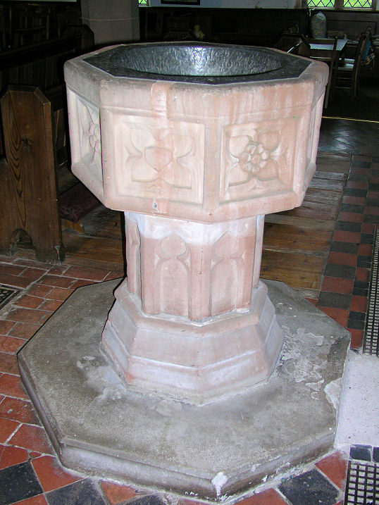
Fonts
No, not this kind of Font - this is the one used in churches for Baptisms...
I mean the Font we use for Print
All of the Accessibility advice - from people with actual accessibility needs - tell us that we should always use a Sans Serif font.
No italics, no words in block capitals, no underlining.
And have clear spaces around each block of type.
And shorter sentences with fewer sub-clauses.
Like this.
Here is a really good document which gives advice : AbilityNet
And this one too: RNIB advice
But...
I often hear sighted people complain
"but those Fonts are so plain"
"I want my poster to look interesting, not boring"
Which means we end up with busy posters that visually impaired people can't read.
Like this one (where I have blanked out the identity of the church):

Well done.
Your posters are not meant to make you happy.
They are meant to give all of the information to all of the people!
Not just the people with eye-sight as good as yours...
No comments:
Post a Comment